by James Clive-Matthews | 16 Sep, 2020 | Narratives & Meanings
 Seeing this graphic doing the rounds. Pretty. Still, call me a cynic, but:
1) [citation needed] – the full graphic lists multiple top-level sources, but without details – what were the exact sources? What was the methodology for identifying this data used by each of those sources? How credible is this information?
2) So what? What useful insight do these lump sums tell us without context? Most of the numbers are random, unrelated big figures, so how does this help us understand the world? What are the trends? What’s the insight?
This is superficially a great bit of marketing, as it’s getting shared a lot and is designed to promote a company flogging a data analytics platform. But there’s no further detail on their site, which is a masterclass in promising a lot (e.g. “Solve back-end integration of any data, at cloud scale, without moving data”) without actually saying or revealing anything about how their tools actually work. To find out more, you need to give them your contact details.
For true data geeks, as for ex-journalists like me, alarm bells start going off at this point:
– Data without context is meaningless
– Single data points don’t equal insight
– Data needs to be well sourced to warrant trust
– Don’t give away your data if you don’t know what you’re getting
by James Clive-Matthews | 21 Aug, 2020 | Systems & Technology
Being a words person it’s unsurprising this piece spoke to me, as it advocates using words as an accessible tool – Google Docs – to improve creative collaboration.
Yes, at its heart, this place is basically saying that a collaborative design/multimedia/dev briefing doc is a good idea – and it’s hard to argue against that.
But it also speaks to a core challenge in the digital creative industries – especially now we’re all working from home and can no longer scribble on whiteboards and move post-it notes around on walls:
What’s the best way to collaborate when developing visual concepts? How can we lower barriers to entry for those with less confidence in their visual thinking skills? How can we encourage more diverse thinking, more originality, while still staying focused on the core objectives?
I’d be fascinated to hear your suggestions / recommendations.
by James Clive-Matthews | 12 Aug, 2020 | Systems & Technology
PDF: Still Unfit for Human Consumption, 20 Years Later
Punchy title and many good points made. But PDFs are an easy target.
It’s also ironic that in attacking PDFs as clunky, hard to read in a browser, and bad for mobile, the authors have created a 2,400-word monster without a single engaging image or design element to break up the wall of text. And they’re so keen to make their point as robustly as possible that a few too many arguments are piled on top of each other – some rather weaker than others.
The point they miss is format needs to be led by function – the medium isn’t the message, but it does shape it. For some functions, a PDF is a better option than HTML, for others a simple email may be best. Your format should depend on your objective, target audience, and what impression you want to leave them with.
Most importantly, *presentation* also needs to be shaped by format, audience, and objective. Sometimes, better a PDF where the design is fixed than responsive HTML that messes up your careful layout when your key client views it on their ancient IE6-running machine. (Bitter experience…)
If you want to persuade, your thinking and presentation always need to be good, no matter the format. Sloppy content structure, sloppy design and sloppy thinking will undermine your objectives far faster than a PDF ever will.
by James Clive-Matthews | 11 Mar, 2020 | Marginalia
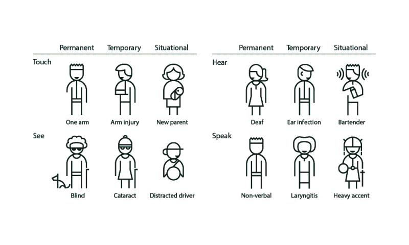 I’m not a fan of user personas. They’re meant to remind us of alternative perspectives, but tend to become either so specific as to make us blinkered, or so single-minded as to be unrealistic.
This piece does a good job of summarising how this fallacy of assuming we can identify user archetypes came about, how it misses so much vital nuance and complexity, and why we need to shake it off if we’re ever going to meet the needs of real users via a more effective, inclusive design approach to developing a better customer experience.
by James Clive-Matthews | 6 Sep, 2014 | Marginalia
This is exactly why I always try to muscle in on the design process:
“what are the ethics of platform design? …When designers create a… news app, they aren’t just designing software. They are creating a platform that participates in constructing an *idea* of news.”
